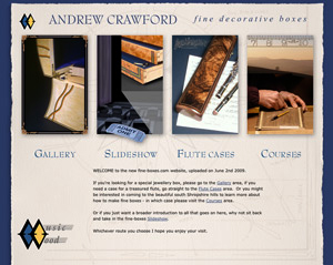
fine decorative boxes – by Andrew Crawford
Welcome to the new fine-boxes website – and thank you for visiting.
This new version has been a long time coming and is very overdue. You will find here all the images, information and interest that were here before, just far better organised and better looking. Most particularly it features a hugely enlarged and improved Gallery.
I hope you will agree that the new look and far easier navigation are an improvement.
The old site:
 The first version of fine-boxes.com was launched in 1997 – and I felt as though I was late getting on the internet bandwagon then! I built the original site myself, knowing just enough to build myself a rudimentary site, but not enough to get myself out of a tangle when I got in one, which was often. The result has been a site with so much overlapping and contradictory formatting as to make anyone in the know who looks at it go into hysterics. Google have also recently been penalising sites with “dirty” code, and no “alt” tags. Horribly guilty on both counts!
I was increasingly aware that neither the look of the old site, its navigation or the quality of the images shown were doing my work justice. The navigation of the “Galleries” area was a particular concern – the constant deep mining and back-tracking necessary to view even a small proportion of what was there was a real disincentive. As a stopgap I added a “Slideshow” which gave fast access to a wide variety of images without the need for heavy mining gear. This was only possible with much help from Chris Sansom – many thanks are due to him for this and his invaluable guidance and technical assistance with many other areas of the site.
Anyway, thank you to the many thousands of you who have visited and supported the old site over the years, despite its often creaky layout and navigation – and also to those who have graced my guestbook with such kind comments.
The new site:
 So – I needed a new site. I wanted someone local to do the technical work – and after a false start with a company who shall remain nameless, I did a search for “web design, Shropshire”. A company called Severn Internet came out no. 1, so they had to be doing something right. And they also just happened to be down the road in Church Stretton.
I did most of the design work, I’m fussy like that – so if you don’t like the design, blame me, not them! I wanted to create a spacious and relaxing environment for comfortable, un-flustered browsing – an oasis from the commercial, banner-strewn, animation-cluttered, bells-and-whistles-enabled sites that currently seem to be the norm. Actually there might be a couple of very quiet bells and the occasional discreet whistle, but these will mostly be going on behind the scenes and shouldn’t distract from the main purpose.
Anyway, many thanks are due to Severn Internet for all their hard work and for accommodating [most] of my whims in arriving at this new version. They have done a wonderful job and I’m very pleased with it.
There are two ways of viewing my work on the new site – the brand new, reorganised Gallery, and the re-styled Slideshow.
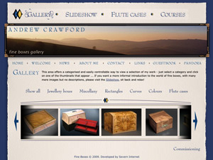 The Gallery gives the visitor the opportunity to select a category, an individual box or case, then enlarge the image into a new “lightbox” format to read a description and view up to seven related images.
Or if you prefer, just sit back and enjoy a less formal introduction to the world of fine boxes in the Slideshow. There are many more images here, including some in-progress shots and some that are nothing to do with boxes but which relate to the wider environment here. The Slideshow can be categorised if you prefer but there are no descriptions.
There are currently many items that appear in the Slideshow that don’t appear in the Gallery – partly because some earlier projects were not photographed as well or in as much detail as I do now. Also some older items that were in the Gallery have been temporarily removed as I haven’t had time to re-work them for the new format. These will be uploaded very soon and there will eventually be more than twice the content that was on the original site.
The Commissions page is accessible only from the Gallery – if you are thinking of asking me to make something for you it is useful to visit here as it may well answer some preliminary questions before you contact me.
Flute cases now have a site of their own here. For now this shows a few nice pics, but will eventually offer plenty of information about the different cases available, ordering info, what’s in stock, feedback from past customers, a dedicated flute cases gallery, flute-related links and much more. Please visit the Gallery or the Slideshow [each will automatically load the flute cases selection when entered from this page] and email me with any queries.
There is a new courses website – www.box-making.com – with all you need to know about coming to Shropshire to learn the art and craft of fine box making.
Other areas such as About Me, Guestbook, News, Links and Contact Me speak for themselves.
 Don’t visit Pandora if you’re in a hurry – it’s full of all sorts of stuff which has very little to do with boxes.
This is the fourth main edition since the site was first uploaded late in 1997, and the first complete overhaul sice 2000. All areas will need some fine tuning and I will be doing this over the next few weeks.
![]()
The wood/music logo:
For almost all the time I have been making boxes I have used the harlequin design as a way to add a simple decoration … and for that reason I have used Picasso’s “Arlequin”, sort of, as a logo on the site. But I wanted to ditch the Picasso logo, not least because it’s nicked from Picasso without any permission – but also I just needed something fresh. I have used harlequins in my designs for a long time and it has become a bit of a trademark – and for a long time I used a pair of harlequins, one blue one yellow, as a logo in various forms.
When searching for something to use to ‘unite’ the new site, I discovered a logo I’d done just before we moved up to Shropshire using the pair of harlequins – and remembered that something of a coincidence had emerged. When the two harlequins are shuffled next to each other they form the letters ‘M’ and ‘W’ – music and wood – my two main activites. Hence the full form of the logo you see here and the rationale behind the ‘new’ logo.
Thank you:
Thank you for taking the time to read this introduction. Any feedback is welcome – as the saying goes – if you like it tell your friends, if you don’t – tell me!
Sensory Deprivation on the Internet